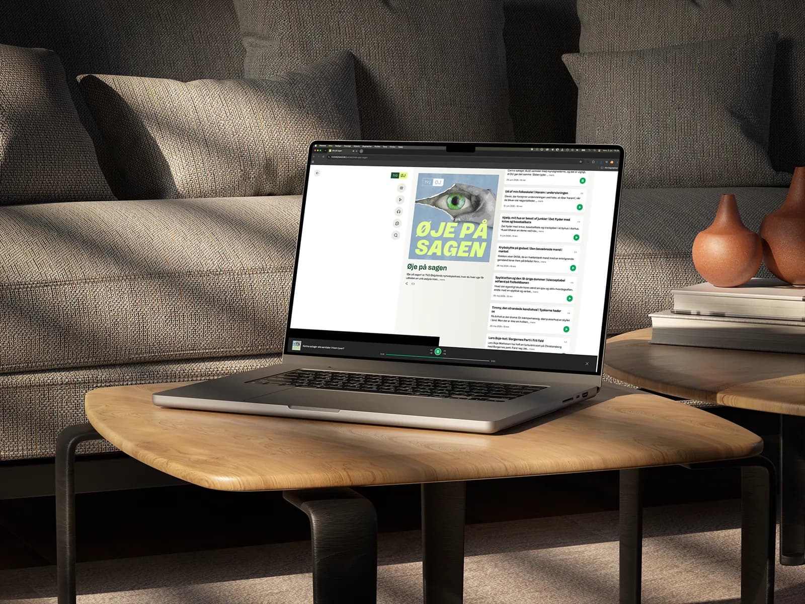
Øje på Sagen
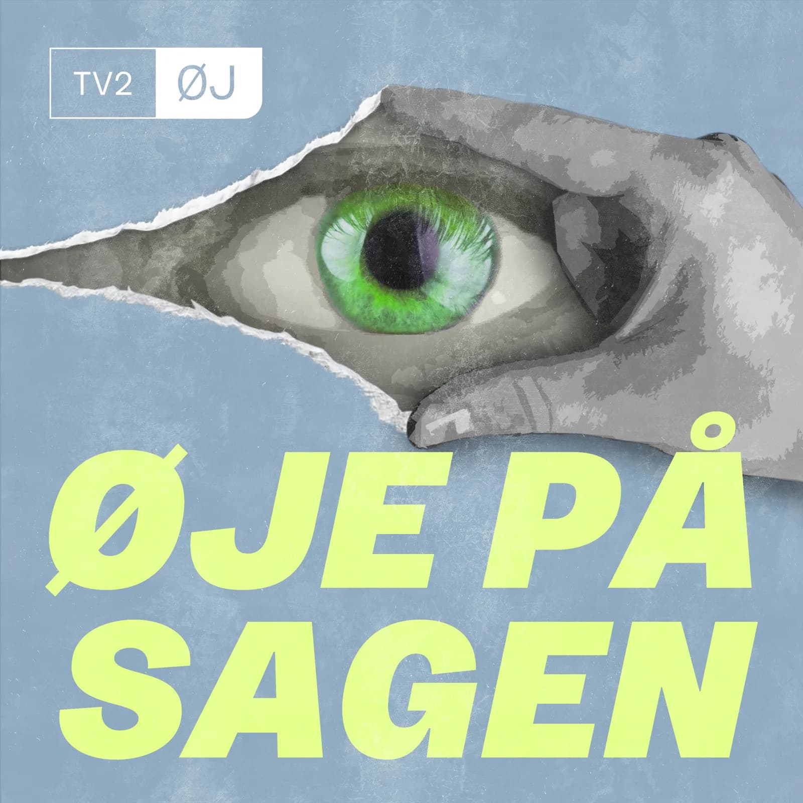
A visual identity for an investigative news podcast, built around one strong symbol: the eye.
- Role
- Design & visual identity
- Client
- TV2 Østjylland
- Year
- 2025
- Category
- Identity, Illustration
01 / 05
The brief
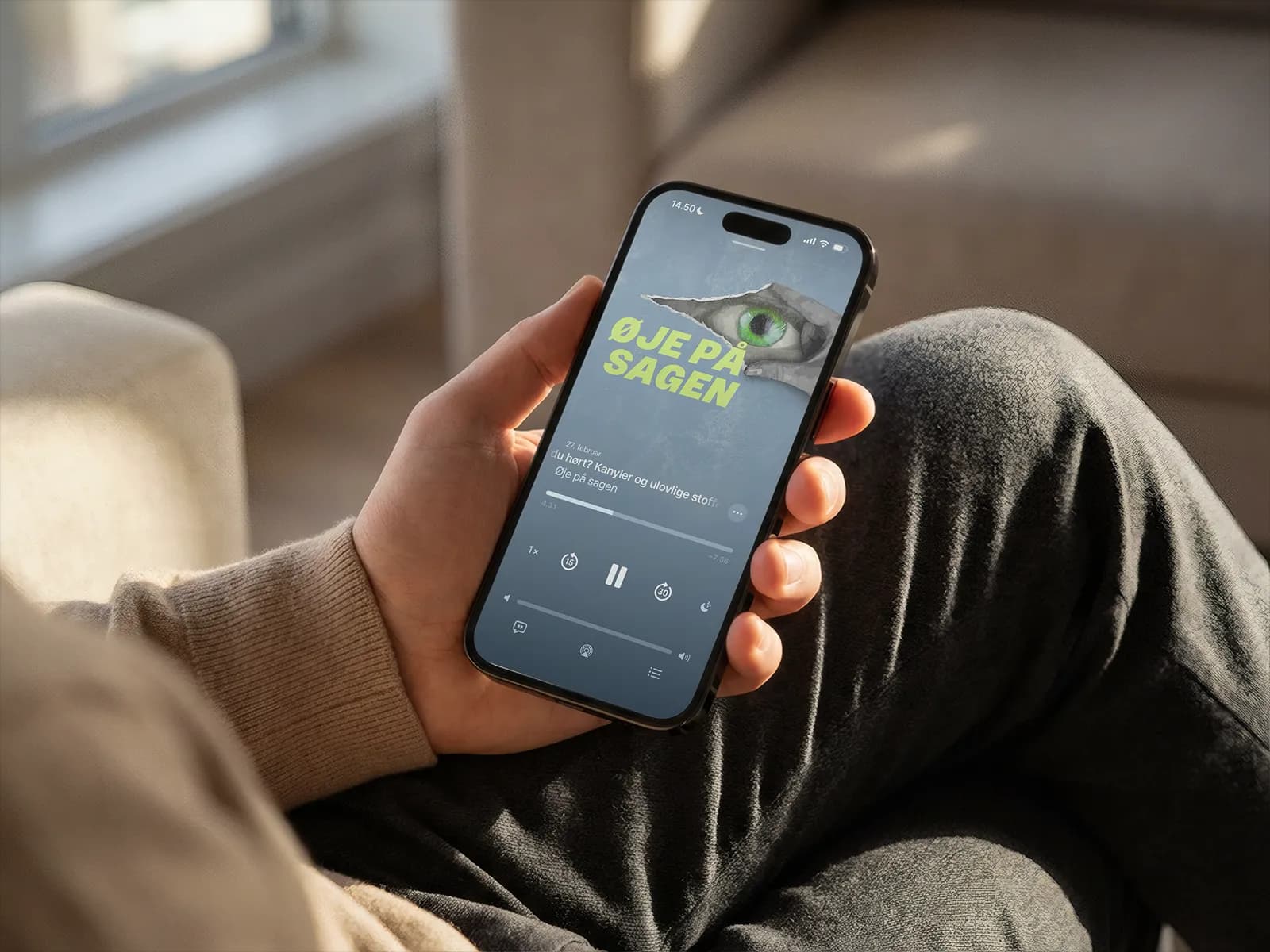
Øje på Sagen explores one East Jutland news story each week. The artwork needed to signal focus and journalistic curiosity before a listener reads a single word.
02 / 05
Small format, strong idea
A podcast cover is often only a few centimetres wide on a phone. That left no room for decorative noise: title, eye and atmosphere had to work immediately.
03 / 05
The eye
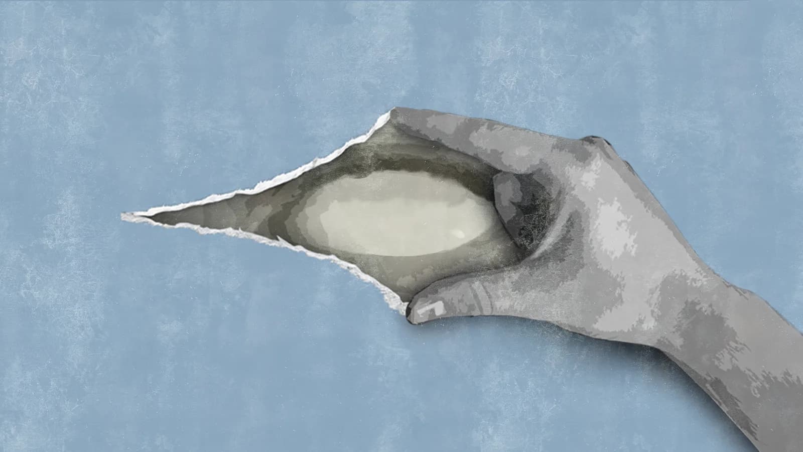
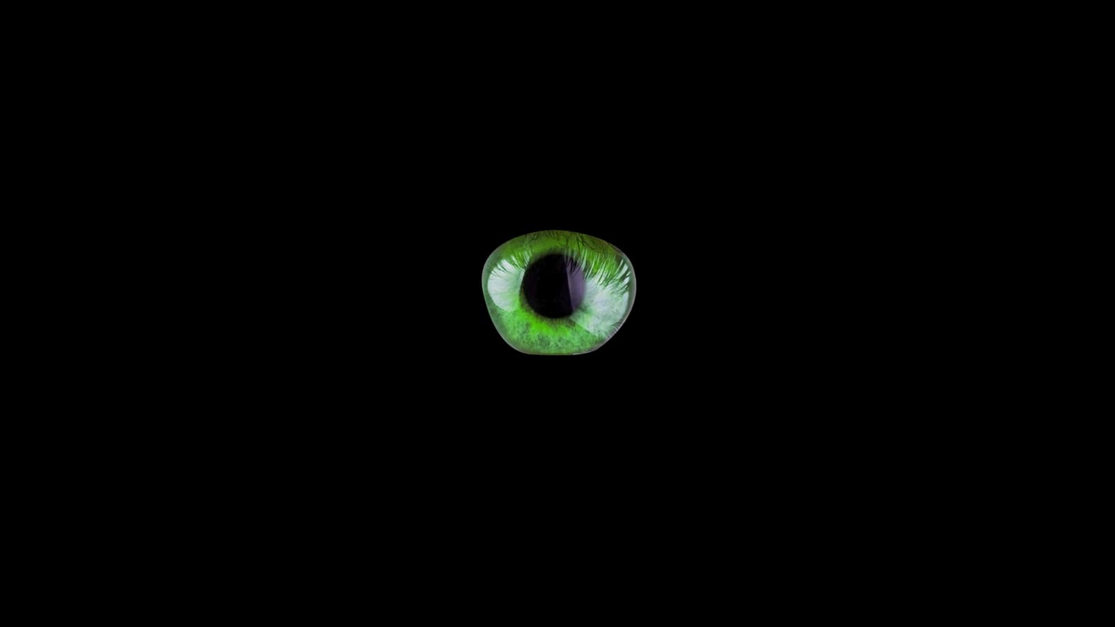
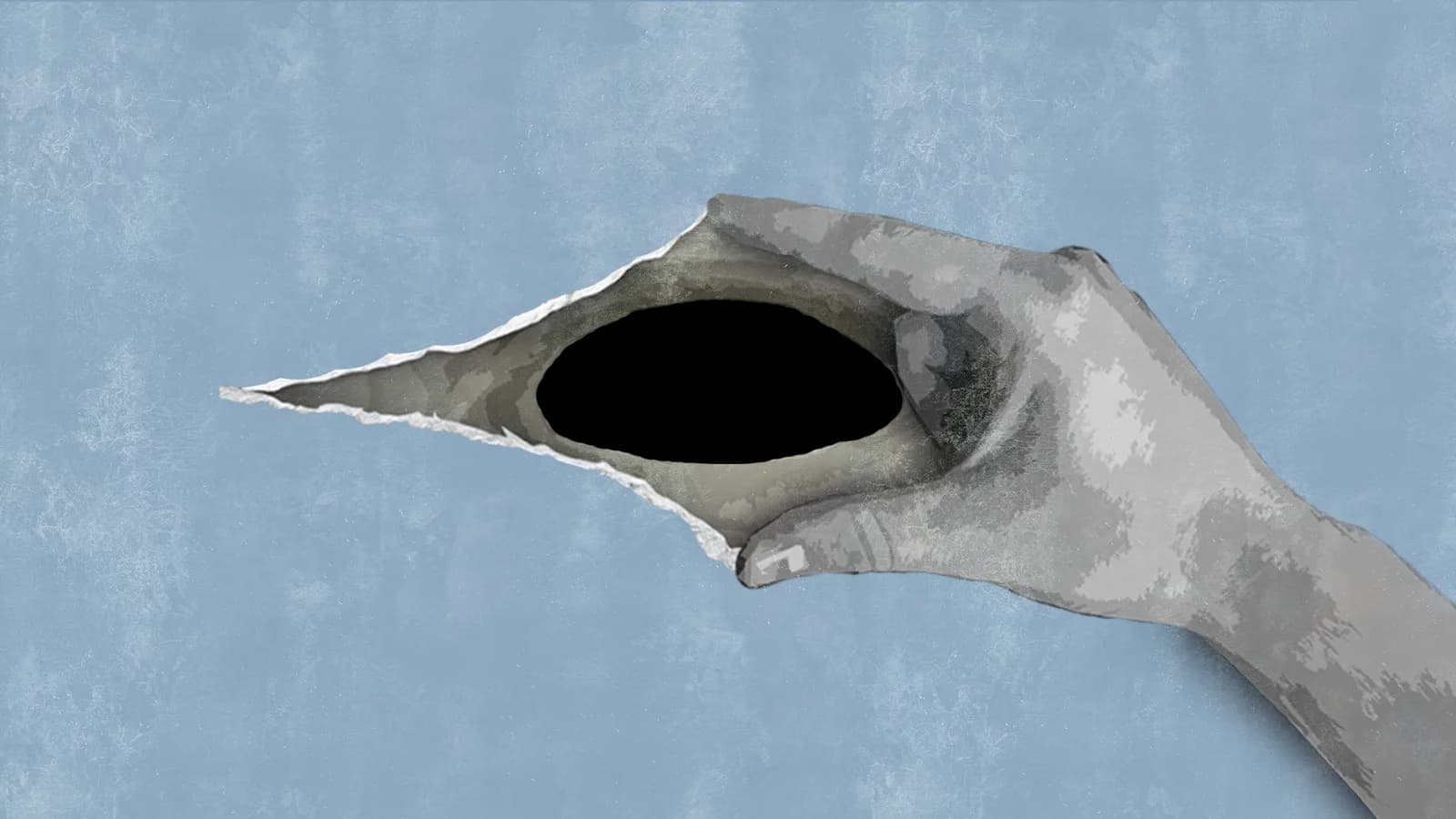
The central idea is the act of looking. The torn paper makes the eye feel like an entrance to the story — or as if the story is looking back at you.
One symbol holds the whole concept together: focus, investigation and curiosity.
 Photo: Christian Solgaard Johansen
04 / 05
Refining the signal
I tested typography, texture and contrast at real thumbnail size. Each round removed another unnecessary detail until the idea became impossible to miss.
- 01Documentary and podcast research
- 02Eye and typography sketches
- 03Texture and contrast tests
- 04Readability checks on mobile
05 / 05
The result
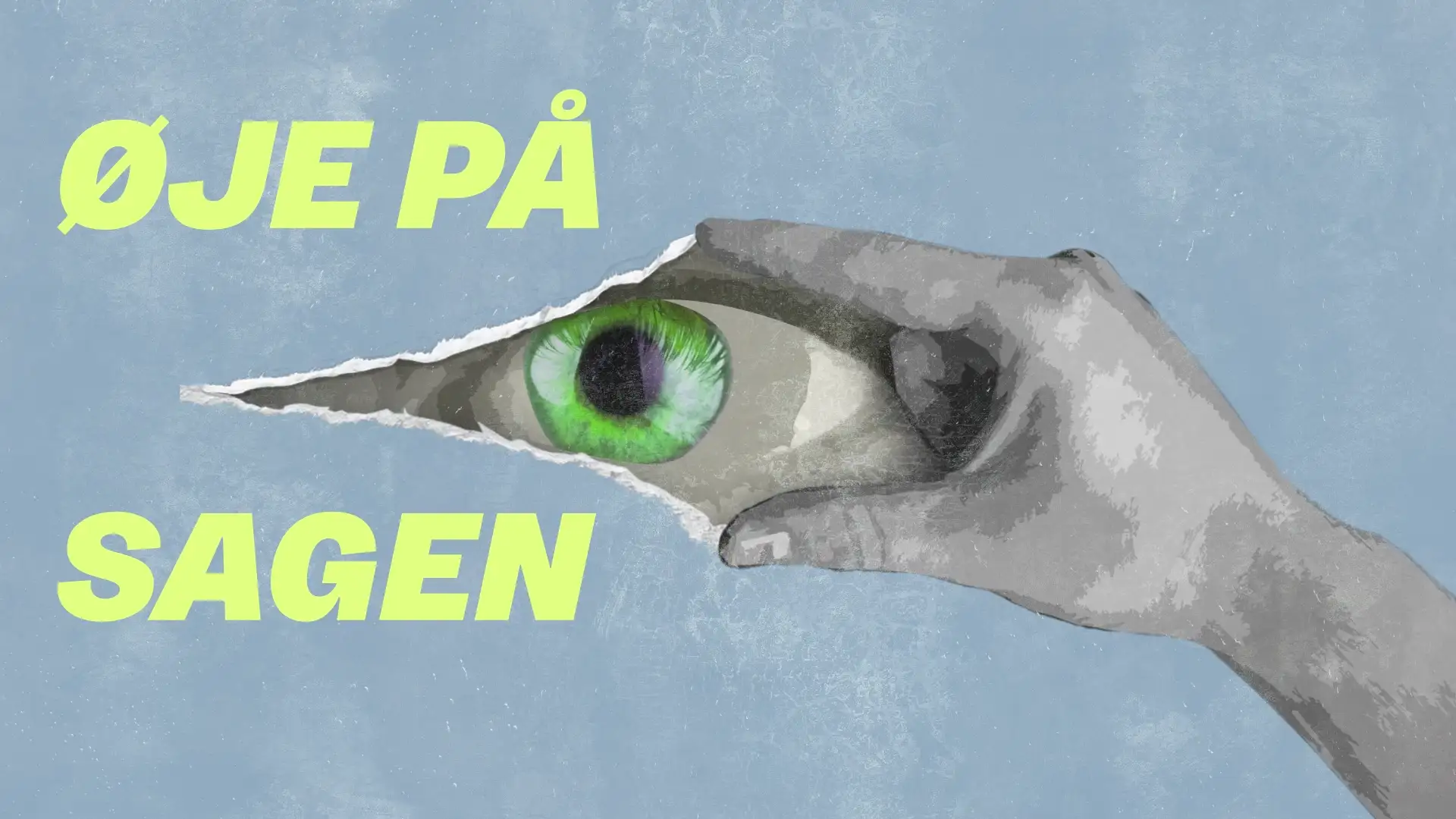
The finished identity is direct enough for a small podcast tile and flexible enough for social graphics, articles, promotion and motion design.
It attracts attention without sacrificing journalistic credibility.
Final visuals
 Photo: Christian Solgaard JohansenPhoto: Christian Solgaard Johansen