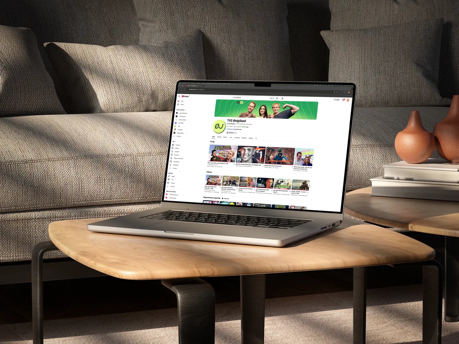
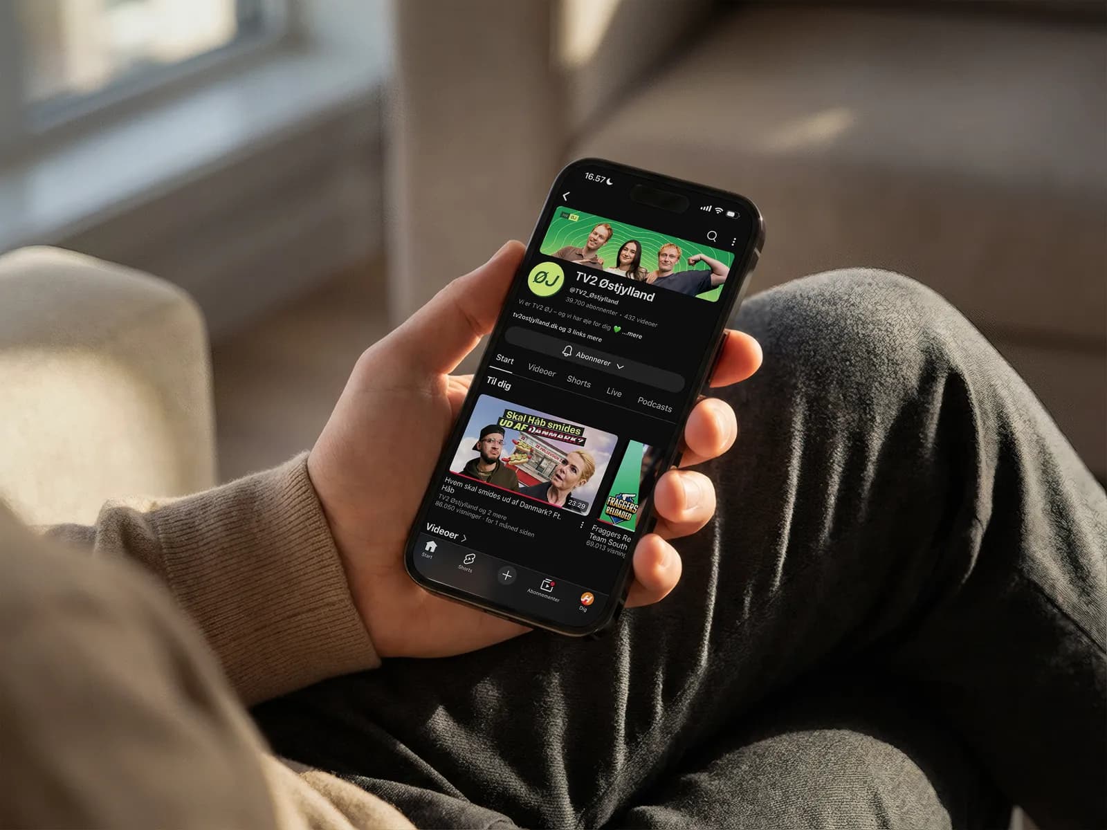
TV2 Østjylland — YouTube
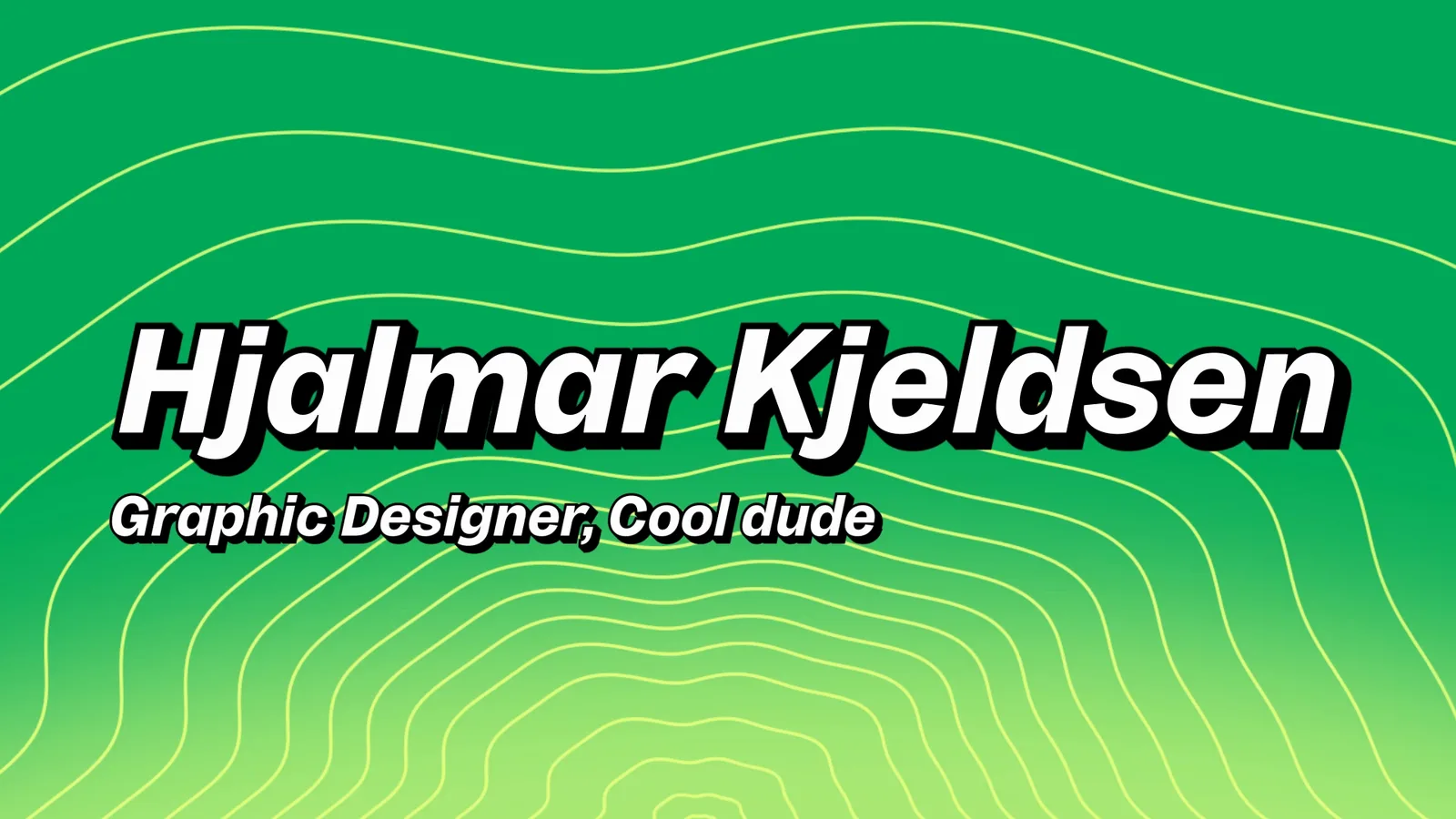
A YouTube identity that speaks the platform’s language — pulse rings, a play-button logo and a thumbnail system made for a younger feed.
- Role
- Design & visual identity
- Client
- TV2 Østjylland
- Year
- 2026
- Category
- Identity, Thumbnails, Motion
01 / 05
The brief
The channel needed a visual language that a younger audience could read in a fast feed while still recognising TV2 Østjylland as the sender.
02 / 05
Credibility at feed speed
The identity could not feel like classic television graphics, but it could not become hollow clickbait either. It needed energy, recognisability and trust in equal measure.
03 / 05
The visual signal
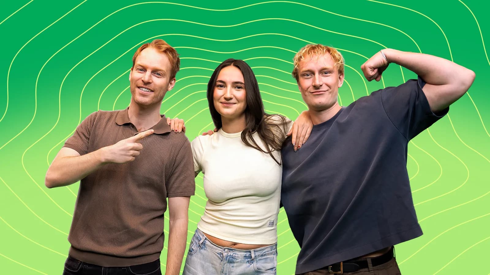
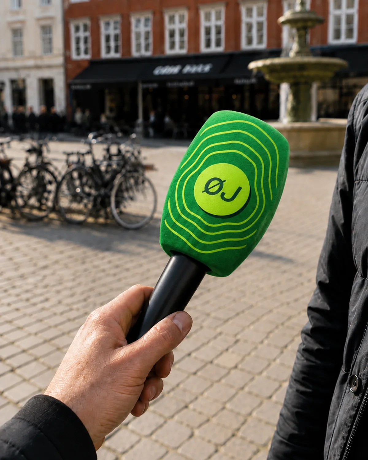
Pulse rings create movement and pull the eye towards the most important person or detail. The logo behaves like a button that activates the content.

04 / 05
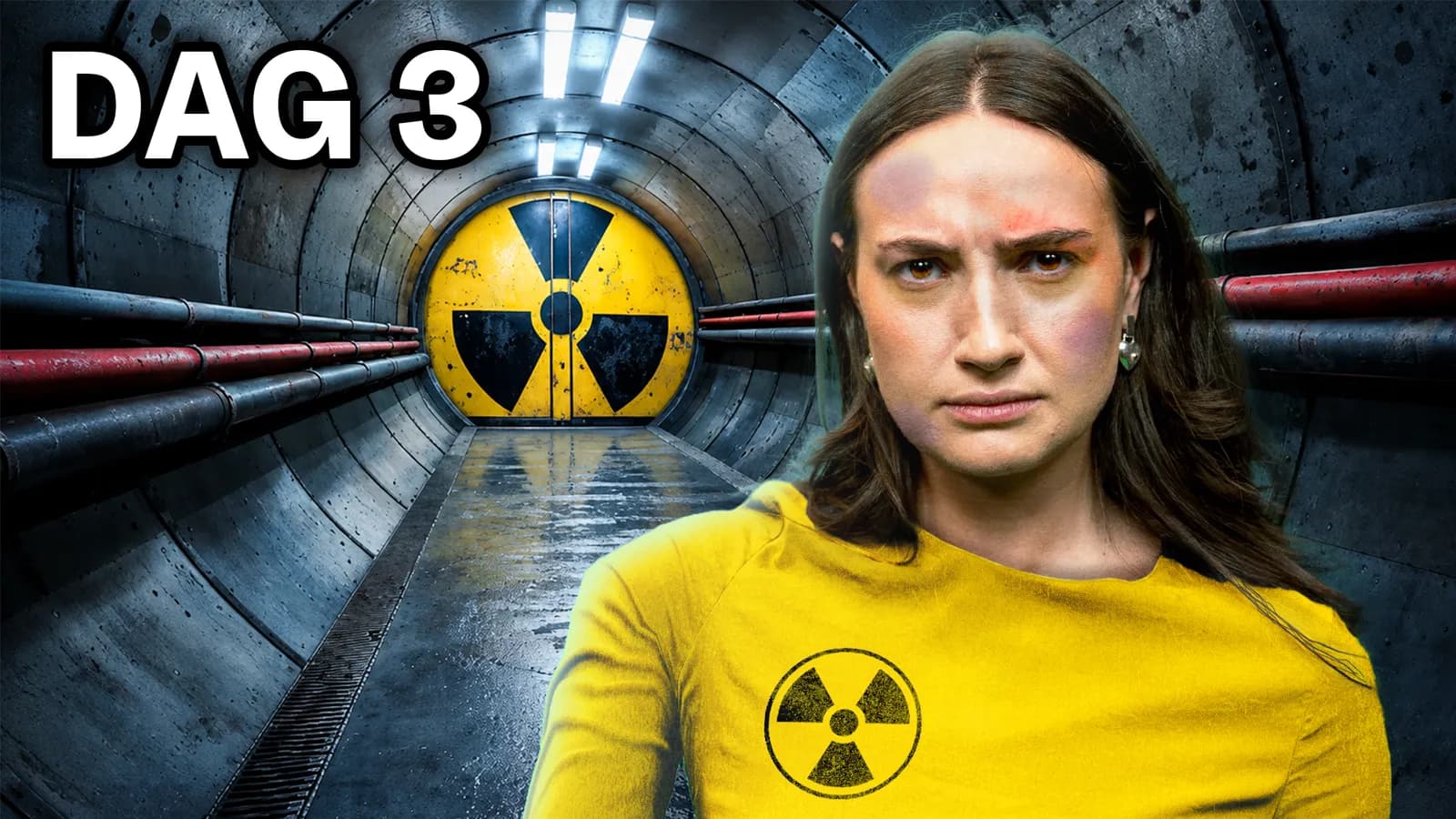
The thumbnail system
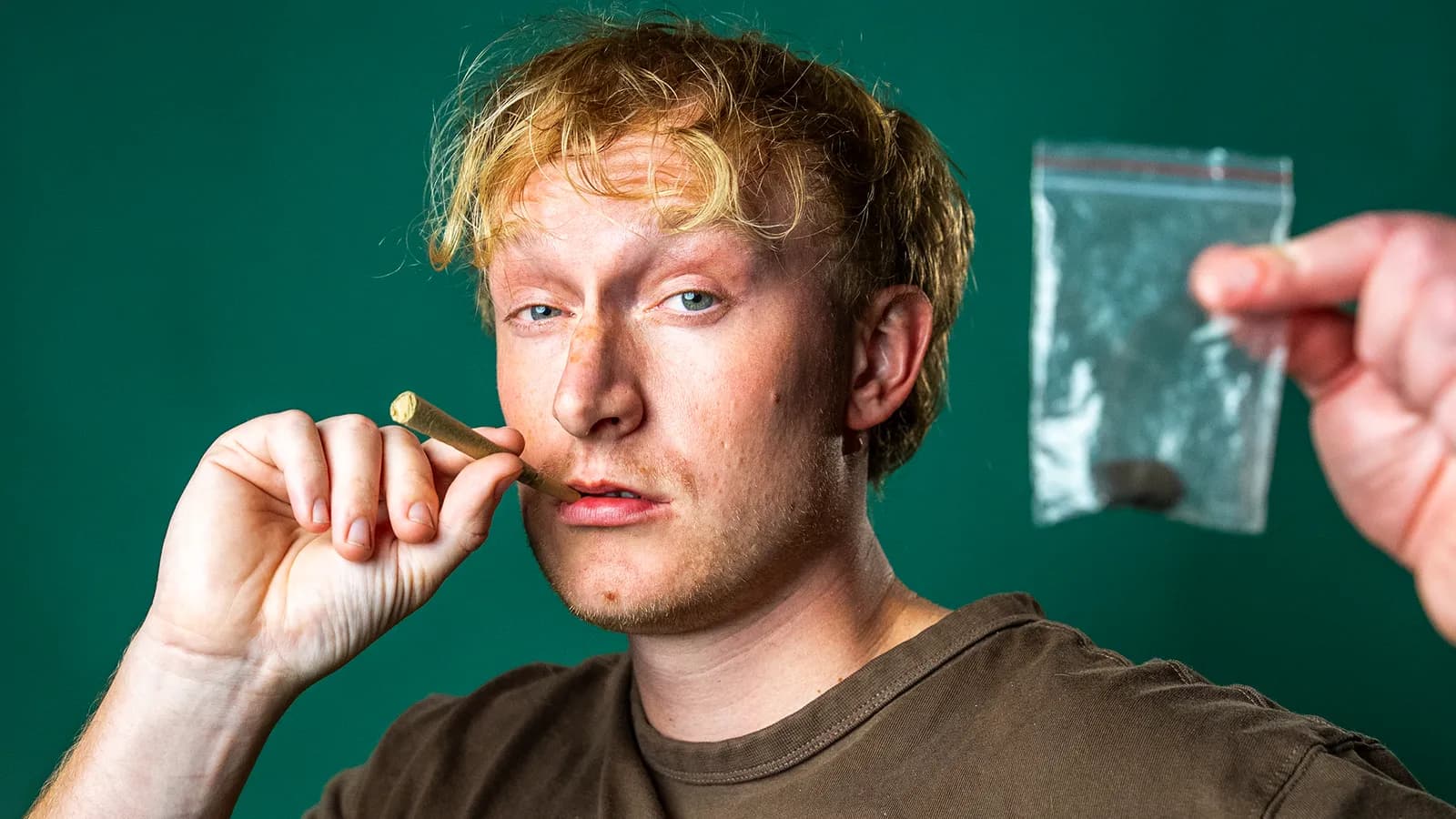
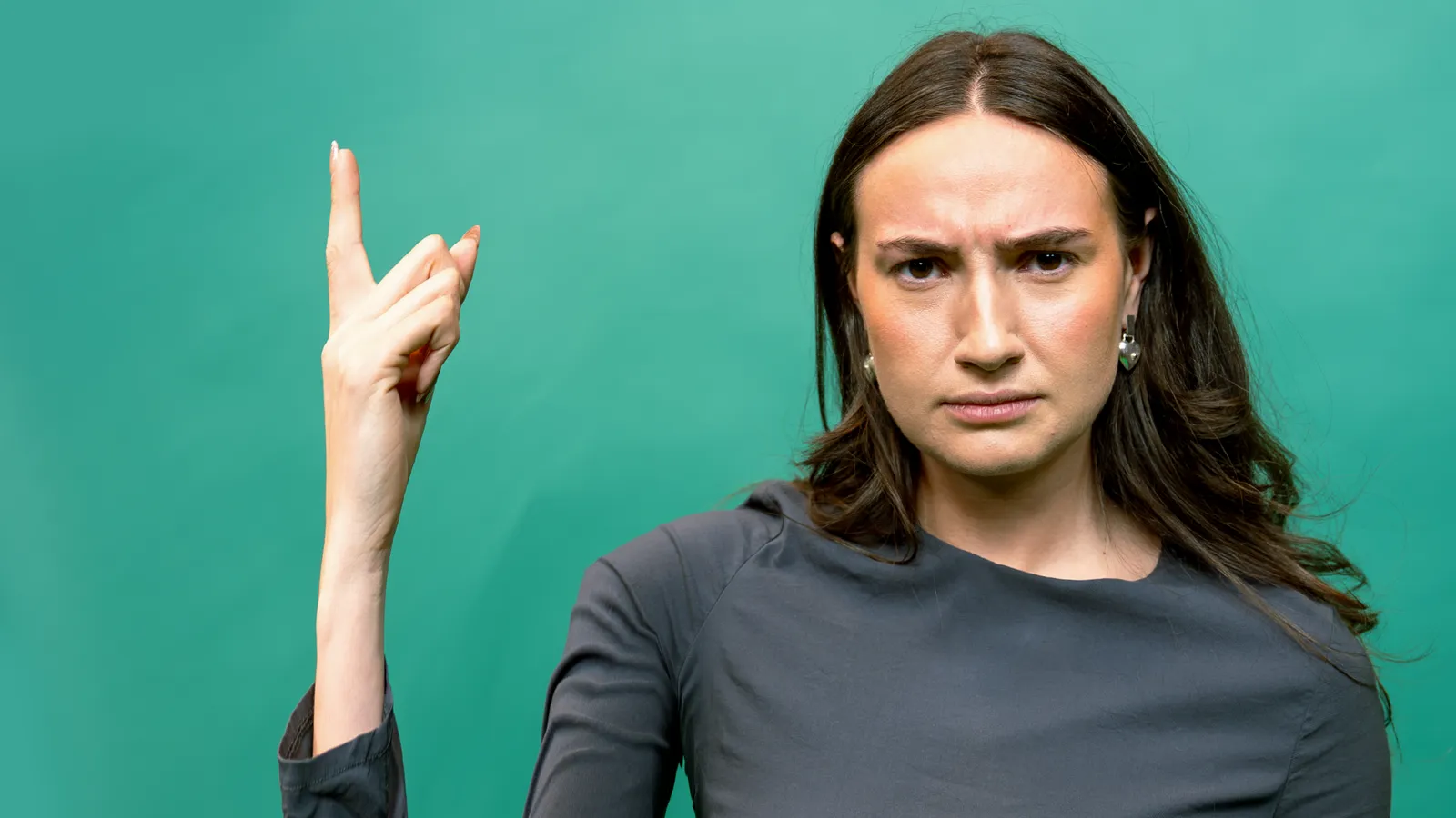
Faces, clear focal points and short typography give each story an immediate entrance. Colour is used more actively than in traditional broadcast graphics, while the green brand remains recognisable.
Drag the slider to compare the raw image with the final thumbnail.
05 / 05
The result
The result is a more direct and platform-aware identity that still feels rooted in TV2 Østjylland.
The pulse rings provide a repeatable signature without forcing every story into the same layout.
Final visuals